Explaination of SVM decision_function
by William Zhang
Introduction
Graph is helpful in understanding how hyperplane works in Support Vector Machine (SVM) method as here represented by the hyper plane (solid) in a 2-D case.
decision_function
All the distances between input sample and hyper plane(solid line) are provided by decision_function(X). It identifies both the distance (>1 or =1) and classification(positive or negative). We already familiar with the supported vectors which are crossed by the positive and negative hyper planes (dashed line).
Decision on random data
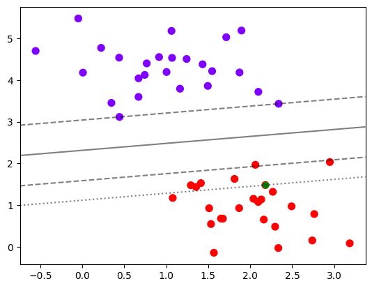
But here we will discuss if you care more about the other data about how does them really look like and how can the their distance be plotted in the graph?
Pick a training data
To locate an training data randomly (e.g. the green one above)
random_point = 30
random_point_distance = clf.decision_function(X[random_point].reshape(1,2))[0]
random_point_distance
1.6466082777946531
It is a positive data with a distance about 1.6 from hyper plane.
Plot the plane accrossing it
level_style=[(-1, '--'), (0, '-'), (1, '--'), (random_point_distance, ':')]
levels, linestyles=list(zip(*sorted(level_style)))

plt.scatter(X[:,0], X[:,1], c=y, s=50, cmap='rainbow')
plt.scatter(X[random_point,0], X[random_point,1], color='green')
ax = plt.gca()
ax.contour(axisx,axisy,Z
           ,colors='k'
           ,levels=levels
           ,alpha=0.5
           ,linestyles=linestyles
          )
ax.set_xlim(xlim)
ax.set_ylim(ylim)
So we got the plane crossing the specific data:
Subscribe via RSS